Column stacking: An interesting way to view the timing of yield curve inversions
12/27/2022
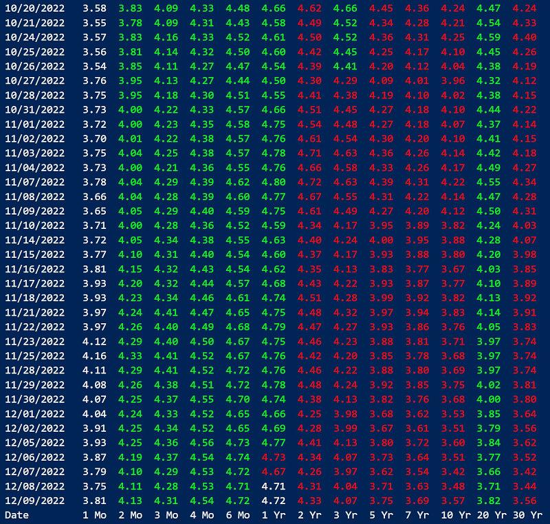
One of our users shared some interesting thoughts on how to visualize yield curve inversions over time. For each day on the yield curve, the interest rates are color coded. Going from shortest term to highest, if the interest rate is higher than the previous as would be in a normal term structure, it appears as green. If the interest rate is lower than the previous as you get in an inverted yield curve, it appears as red.
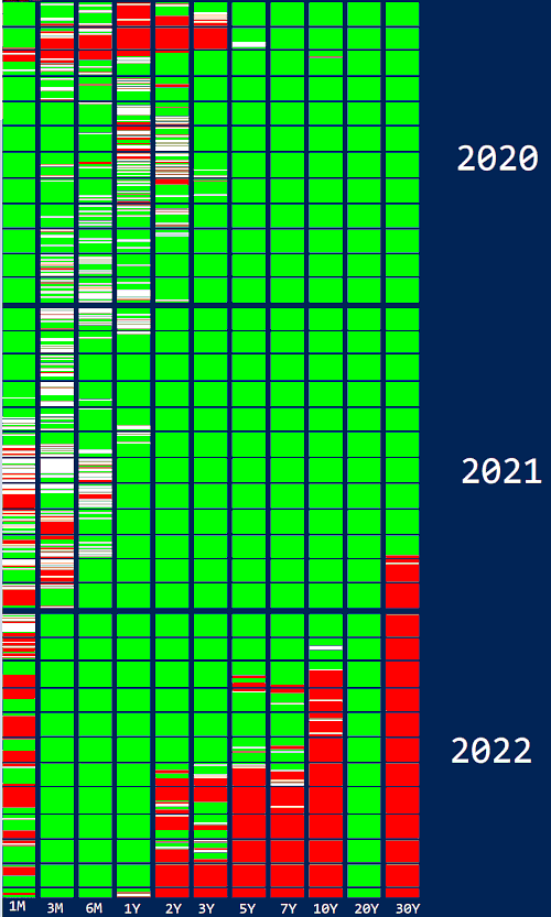
This term structure inversion color coding can be further distilled into simple green or red bars, compressing all of the dates into a continuous image that acts as a sort of bar chart showing the term structure inversions over time.
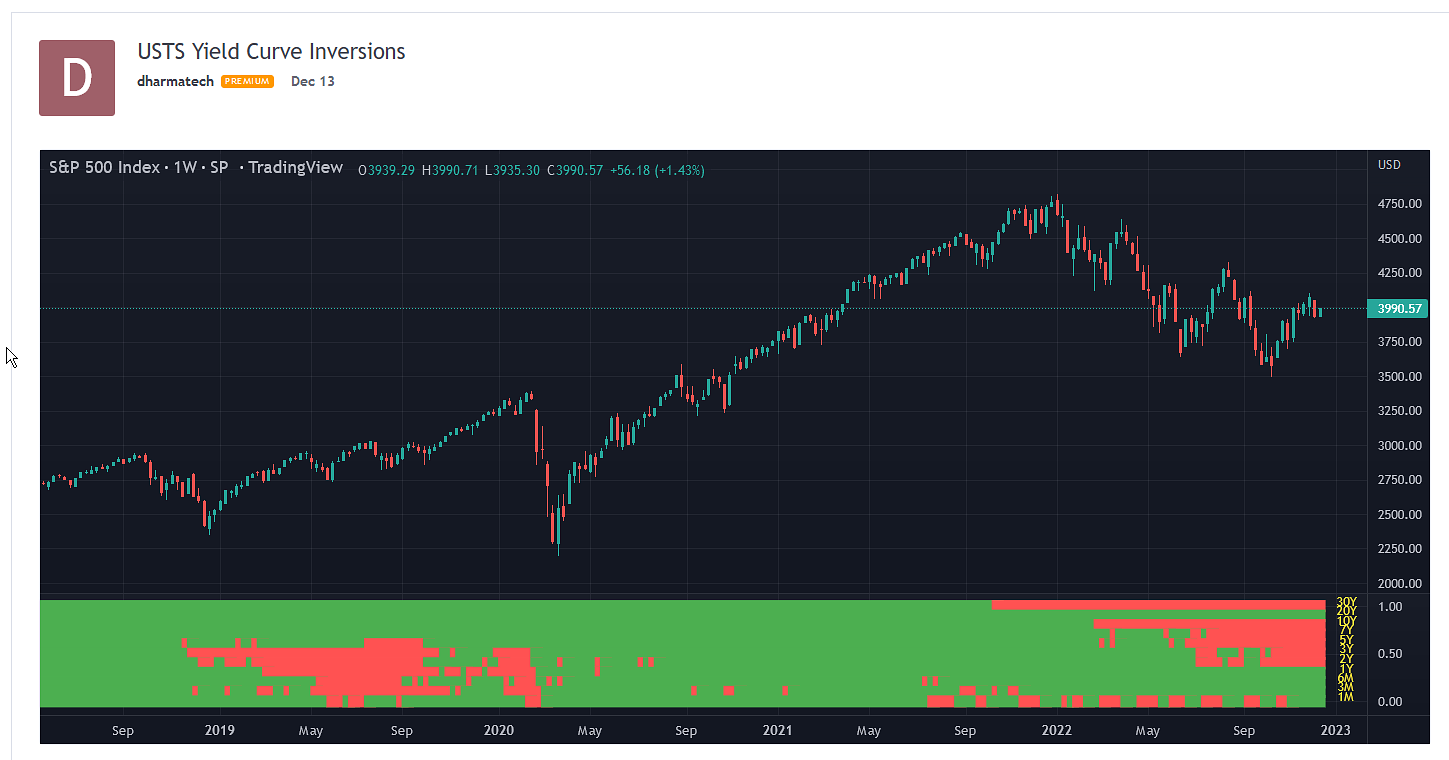
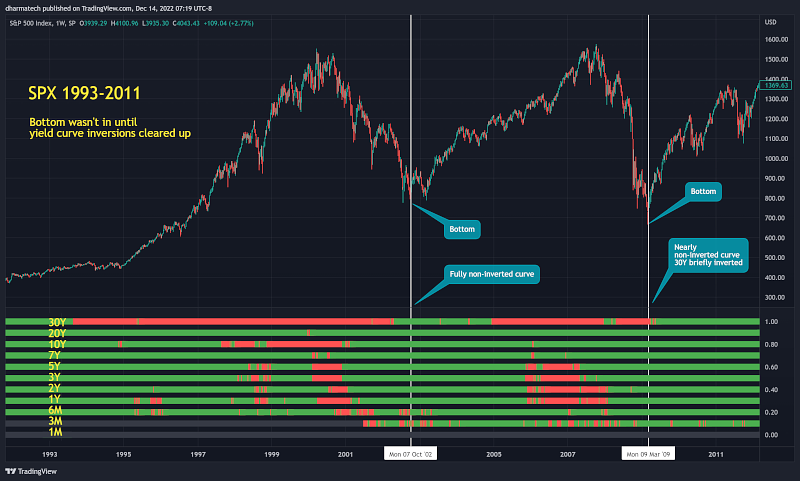
As you can see from the above image, this way of displaying yield curve inversions provides an insight into which parts of the yield curve are inverted and how widespread. This data can be taken a step further by comparing the time series against charts of the major stock market indices. Here is the yield curve inversion data compared to a chart of the S&P 500, via TradingView.
As you can see from this small sample, heavy yield curve inversions historically have preceded major bear markets, and reversion of the yield curve to a normal upward sloping term structure tends to coincide with the beginning of new bull cycle.
This makes perfect sense as such bear markets are typically caused by economic conditions that would prompt the Fed to lower interest rates to stimulate the economy, bringing down the short term end of the yield curve. By the time long term interest rates adjust to the new normal, the monetary stimulus has taken effect, the economy is on more stable footing, and there is increasing likelihood of a return to a more restrictive monetary policy (i.e. higher future interest rates).
Special thanks to Eduardo Cavazos for sharing this interesing perspective! Check out the Twitter post on this topic for more detail.