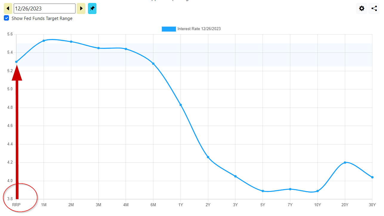
We just added the Fed's Overnight Reverse Repurchase Agreement Award rate to our yield curve and time series charts, denoted as "RRP". In context of the term structure of interest rates, RRP is the shortest of short term yields. It is the overnight interest rate awarded by the Fed in exchange for holding collateral. Banks use this facility as a means to generate return on their excess deposits.
The Reverse Repurchase facility is an instrumental tool used by the Fed for keeping short term interest rates within the FOMC's Fed Funds target range. Because the Fed decides the interest rate on the Reverse Repurchase facility, it sets a floor on interests. Without this facility, interest rates could potentially drift below the Fed Funds target range.
The Reverse Repurchase facility is only available to member banks, which includes commercial banks, investment banks, credit unions, and money market funds. It is not available to individuals. In theory, some of the money earned by the banks on their deposits would pass through to the bank's customers in the form of interest, with the bank keeping a spread as profit. However, many of the larger financial institutions lately have been keeping the reverse repo earnings for the firm, and paying depositors a very low interest or nonexistent rate. Investment into money market funds are probably the best way for individuals to capitalize on this Fed tool, albeit indirectly.
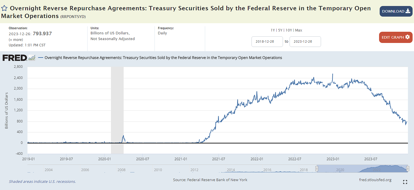
The Reverse Repo Facility Balance is Declining
Lately some experts who closely follow the Fed have noted that the utilization of Reverse Repo facility has been declining in recent months. The Treasury Department's fiscal stimulus efforts in 2020 and 2021 led to many individual homes being sent checks directly, which ended up as deposits in the banking system. A good share of this influx of deposits made its way into the reverse repo facility as banks needed a place to put the excess cash on their balance sheet to work.
At it's peak in 2023, the facility had nearly $2.5 trillion. As it's usage declines some believe this is a sign of drying up excess liquidity in the banking system. This could occur for a variety of reasons. Banks may be finding more attractive short term investments for their excess deposits. The customer deposits may be shrinking, causing money to flow out of the banking system into other places. That could be inflationary if not coupled with a decrease of the money supply. If banks are putting their excess deposits to work in longer duration investments, there is an increased potential for stress within the banking system if a large amounts of deposits are unexpectedly withdrawn.
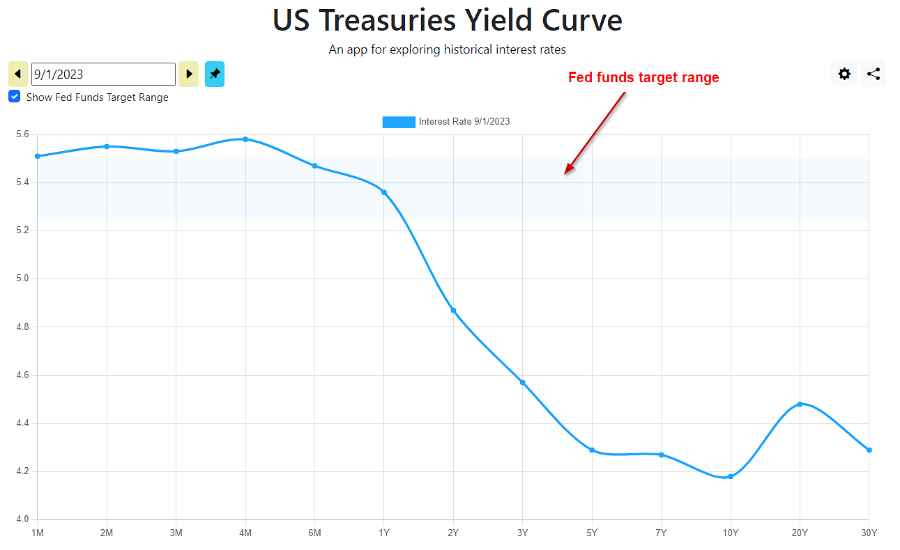
This Labor Day weekend we launched a significant update to ustreasuryyieldcurve.com, adding the Federal Funds Target Rate to the US yield curve chart. The FOMC expresses its target of the short term overnight lending rate for banks as a range, currently at 5.25-5.5%. This is the interest rate widely cited in the media whenever the Fed raises or lowers interest rates.
The data is available back to 1982. Prior to October 1982, the Fed targeted M2 money supply growth instead of setting a specific interest rate. The M2 control policy was specifically designed to combat high inflation during the early 1980s recession, and ran from October 1979 to October 1982 under the leadership of Paul Volker. Prior to that, the Fed did control interest rates through open market operations, but did not publicize its interest rate targets as it does today.
This update also introduces a change to the navigation on the yield curve page. When clicking the "Pin current dataset" button, the cursor changes so that the newly added dataset becomes the active yield curve when you change the date. This makes it easier to order the dates chronologically.
Now you can view Canada's yield curve on this website with data going back to 2001. Given the focus of this site being US Treasuries, it might seem an odd choice for a new feature. Here are some reasons on why this addition makes sense:
The global economy is very interconnected, and this is a first step to providing other rates of interest (pun intended) to investors following macroeconomic trends.
It will hopefully broaden the audience to this website, which helps financially support all of its features.
Acquisition of the data from the Bank of Canada is a fairly simple addition.
From a coding standpoint, building this feature evolved in the underlying code in a way that lays the groundwork for the next set of enhancements related to the US Treasury interest rates.
We hope you enjoy this new data set and find it interest-ing!